IF I WORKED AT INSTAGRAM
Post Preview
FOR CURATING your profile
💁🏼♀️ "If I worked at" SERIES
This post is a part of a series where I use my passion for Product Design to shamelessly make improvements to the applications and websites of company’s I want to work for.
HIRE ME, HERE’S WHY!
Hello WorlD:
Instagram announced their new Post Preview feature.
Want to see the prototype? — 🔗Here’s the link!
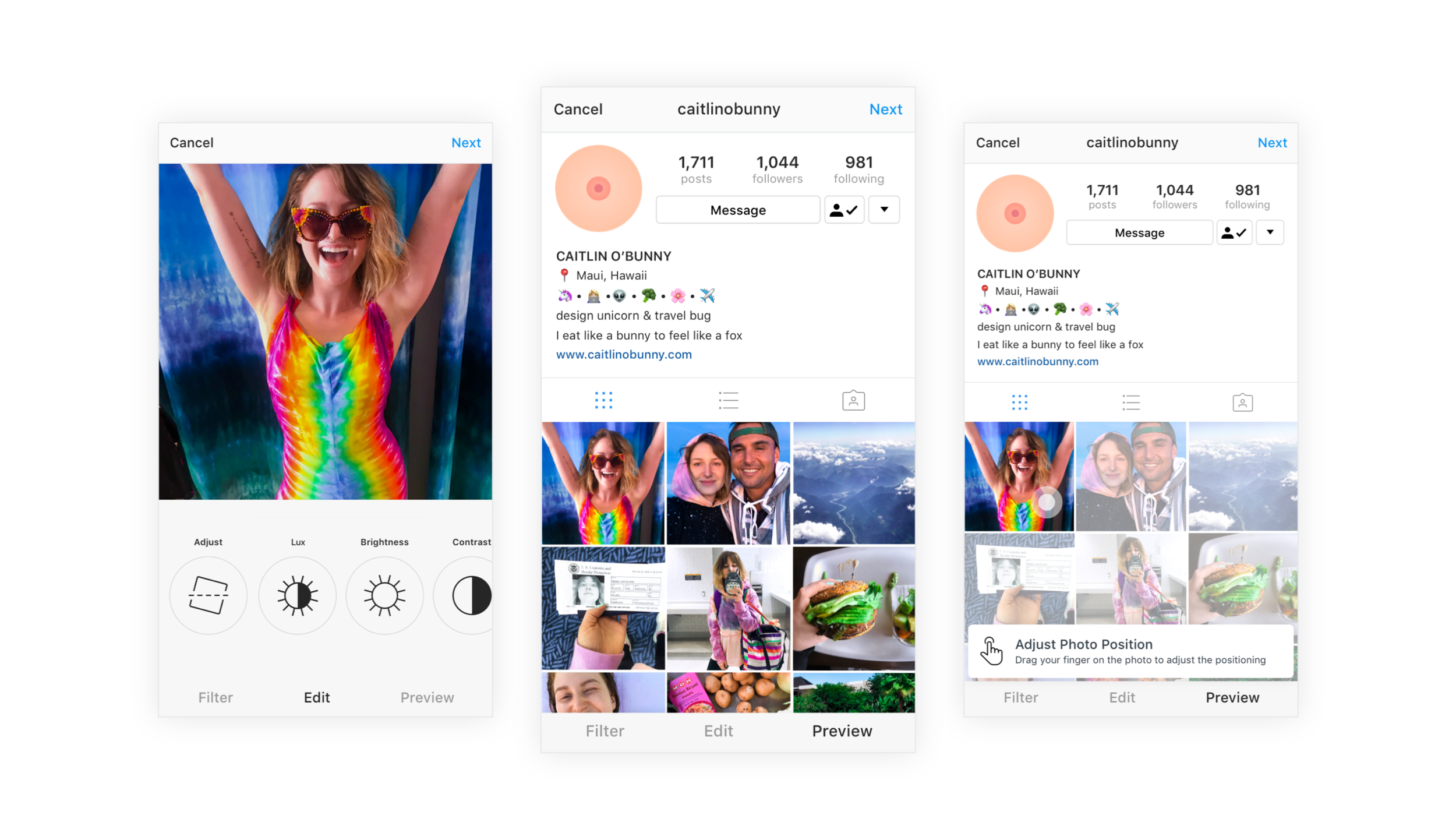
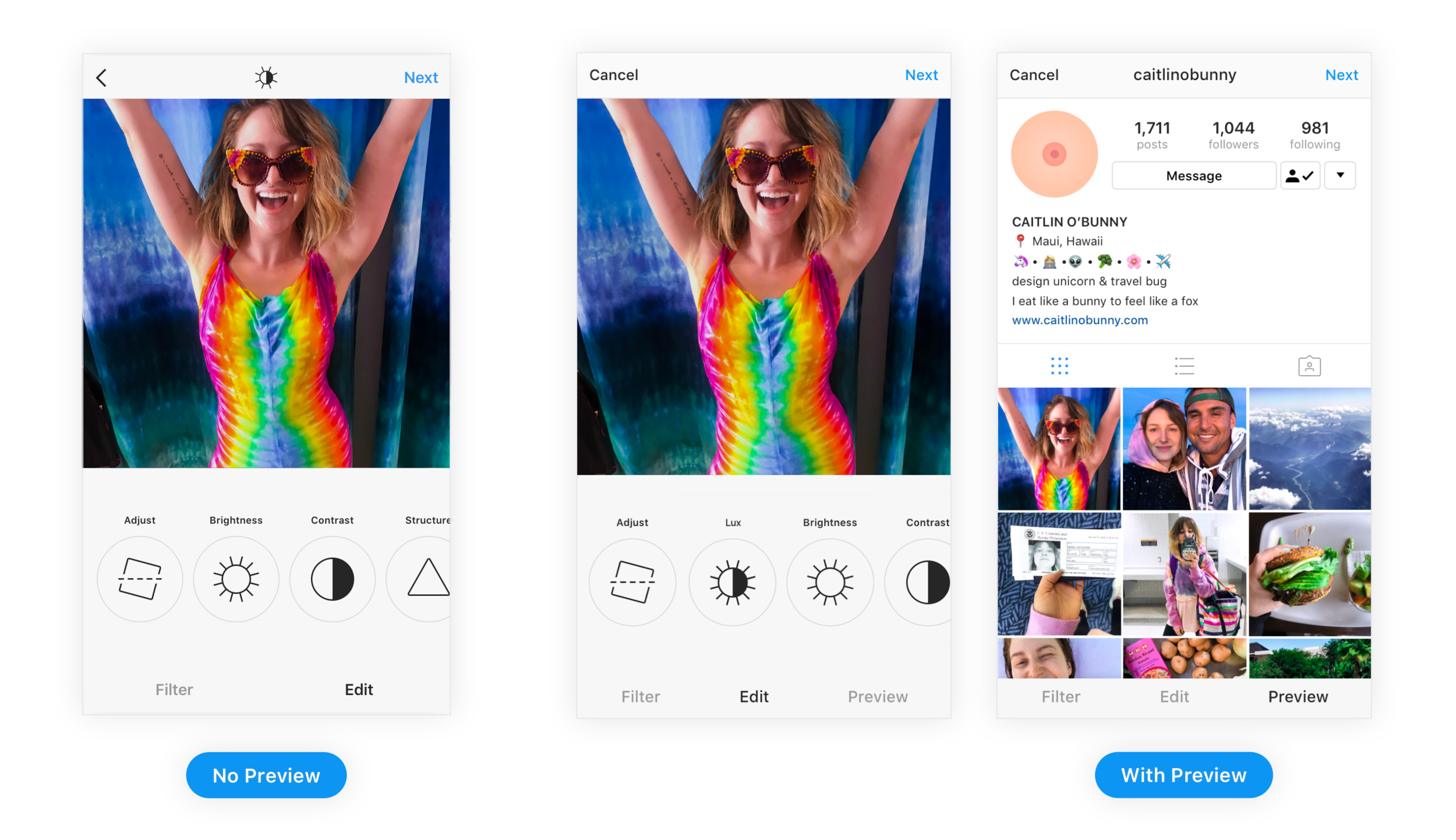
This feature allows you to preview what your post will look like on your profile prior to posting. Now it is easier than ever to control your profile aesthetic .
New UX
Preview Tab
Have you ever spent a great deal of time editing a photo to try and match the rest of your profile and then, when you finally post the photo you realize…
“Oh no, that picture doesn’t even look good beside my last post…”
Delete!
Now with the Preview Tab you will be able to see what your photo will look like before you post it, and avoid the awkward posting and deleting situation.
Adjust Photo Position
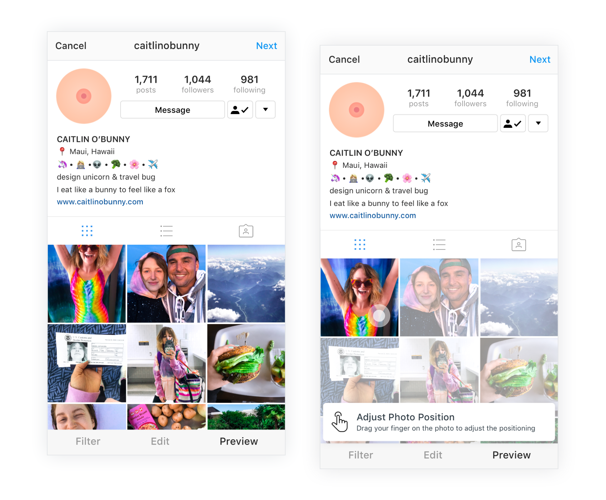
This tab also allows you to adjust the photo’s position within the frame when displayed on your profile. All you have to do is use your finger to drag the photo to your desired position.
Notice how @caitlinobunny's head is being cropped out of the screen on the left. Now that you can adjust the positioning, she was able to fit all her excitement into one frame.
🤷♀️
CAN’T FIND Post Preview?
That’s because I made it up!
👋 I’M CAITLIN O’BUNNY 👋
And I love using my passion for Product Design and sense of humour to design the future of my favourite applications.
Wish Profile Styling was real?
Give my Medium article a clap


